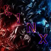
PowerlinX Posted April 13, 2014 Report Share Posted April 13, 2014 I came back to this forum yesterday out of boredom, and remembered how active I used to be with the graphic design community, so I ended up shitting this out. I'd love feedback on how to improve this. Link to comment Share on other sites More sharing options...
LiAM Posted April 14, 2014 Report Share Posted April 14, 2014 I'm no expert with tags but on the surface I can say the placement of text to focal image is a little off, hard to focus. The focal doesn't seem to stand out too much either. Maybe more use of colour, I like how the pink starts to come in from the top, but then's lost anywhere else. Whole image too seems to be a little blurred, or at least the parts around the focal. Link to comment Share on other sites More sharing options...
PowerlinX Posted April 17, 2014 Author Report Share Posted April 17, 2014 Thanks for the feedback. I had read the stickied Tag guide in Tutorials, and was going for a two-tone color scheme of blue and purple but now that you pointed it out, pink seems like the much better option. I'll update it in a bit because I really want to get back into this :) I would like to ask, though, where would be a better position for the text? Or would it be better with no text at all? I honestly have no idea. Link to comment Share on other sites More sharing options...
'tyleR Posted April 17, 2014 Report Share Posted April 17, 2014 Too much purple homie. Bring the focal in focus a bit more and create more of an atmosphere. Again, really adding another color besides purple is one of the best thing you could do. I'd drop the text but honestly that's up to you breh. Peace & Love <3 Link to comment Share on other sites More sharing options...

Recommended Posts
Archived
This topic is now archived and is closed to further replies.